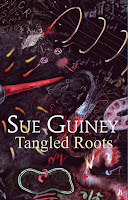
We are told not to judge a book by its cover, but we all know that it is the cover which leads us to pick a book off a shelf in the first place. It is the look of a cover which leads us to be intrigued and without that initial intrigue, the brilliant and beautiful words found within that cover might never be read. And so, publishers and authors spend a lot of time thinking about cover design and the words that are superimposed onto that design, and rightly so.
But how does a cover design come about? Well, it’s not just about finding a pretty picture. Go into a bookstore and browse around. You’ll see that different styles have come to mean different genres even without our being aware of it. What would a drawn figure within a pastel coloured backdrop mean to you? What about dark coloured scenery with a figure in shadow? How about an image of a person walking away from you or seen from a distance? How about an image with no people in it at all? And what about poetry? (Yes, what about it, indeed?). Different styles have come to mean different genres, and bookstores rely on this sort of instant identification to help steer their customers towards the books they might want.
I have been lucky to have publishers who have allowed me to work closely with them to construct my covers, and people have always commented on how great my books have looked. It has also always been important to me that the cover indicates, to a certain extent, the theme or atmosphere of the book. For example, my first novel, Tangled Roots, is about the jumbled life of a physics professor:
My first Cambodian novel, A Clash of Innocents, needed an Asian feel and an inkling of childhood:
My poetry play,
Dreams of May, leads the reader into the internal world of a woman and has a tango fantasy as its centre point:

while my poetry collection,
Her Life Collected, begged for something hinting at archetypes:
So now it is time to design the cover for my new novel to be published in January, and there were several things to take into consideration. Firstly, this is my second Cambodian novel, and although it isn’t a sequel to the first, there should be a sense of continuity between the two. The story being told is rather dramatic and, at times, dark, and we wanted a hint of that. And this time, a direct link with the title made sense. Many images were tried but one stood out clearly to be the best, but before we could put it together we had to move onto the second stage of the design, namely, the blurb.
Blurbs are notoriously hard to write. They are marketing tools, and so they have to walk a fine line between advertising and journalism. The blurb must quickly tell enough of the essential elements of the story to take a potential reader from that initial intrigue to a real interest. What is this book about? Where is it set? Am I in for a bit of escapism or something thought provoking? Getting the right tone and the right length is not easy. This time around, I came up with a first draft, which the publisher tweaked, added to, then subtracted from, asking my advice and taking more suggestions until we found the right sort of blurb for the book. Like I said, it wasn’t and never is easy.
And then comes the next questions.
Who is this writer? Have I ever read his or her work before, and is there anyone else out there who can vouch for him or her? — i.e. the book quotes. Sometimes, advanced praise for the book is solicited. Other times, testimonials are gathered about previous books. This time, we opted to link the two Cambodian novels by providing (complementary, of course) reviews from the previous one. Put it all together and,
voila, please welcome the cover of my next novel,
Out of the Ruins, due to be released in January 2014:
So, what do you think?
If you’d like to look at the other posts in this series, here they are:
 while my poetry collection, Her Life Collected, begged for something hinting at archetypes:


I was sat in an airport lounge people watching. There were these couple buying books at WH Smith 3 for the price of 2.
They based their choice decision solely on the cover. They never read the blurb on the back, the reviews or the first few pages.
I love the cover of your new novel. I didn’t like the cover of your last.
Fascinating post, Sue. Glyn, the previous novel cover did divide opinion – some absolutely loved it, others didn’t. But it is successful in getting the book into shops. Of course the next step is tempting buyers in shops to pick up the book and want to keep it. Bookshops are always able to return books to the wholesalers/distributors so we do have to work hard to make each step in the sales process work.
Congratulations, Sue!
I really like that cover and I’m already looking forwards to reading the novel.
Great cover, Sue and congratulations – all very exciting and, I must say, lovely to see all the covers of your publications together. Roll on January and the launch!